Five Before Five: Charlotte Heal’s Most Loved Layouts
When it comes to intelligent, well-crafted publications, Charlotte Heal is like superwoman. The London-based designer and art director's portfolio is packed with some of our favourite editorials and layouts.
Here, she shares her top five creations.
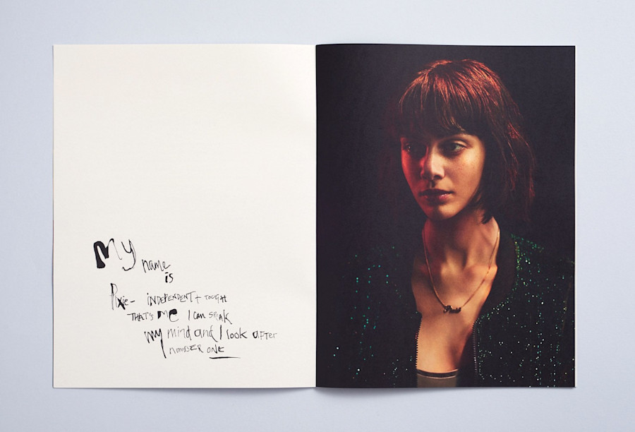
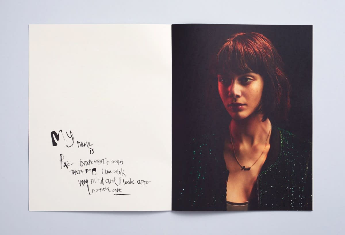
Dreamlands for Rattling Stick
For this publication I hand rendered the type drawing inspiration from Jim Goldburgs’ ‘Raised by Wolves’ book. I really enjoyed getting into the mindset of the characters and feel this is the most successful spread. There was something very librating about going back to pen and ink and crafting each letterform.
For this publication I hand rendered the type drawing inspiration from Jim Goldburgs’ ‘Raised by Wolves’ book. I really enjoyed getting into the mindset of the characters and feel this is the most successful spread. There was something very librating about going back to pen and ink and crafting each letterform.
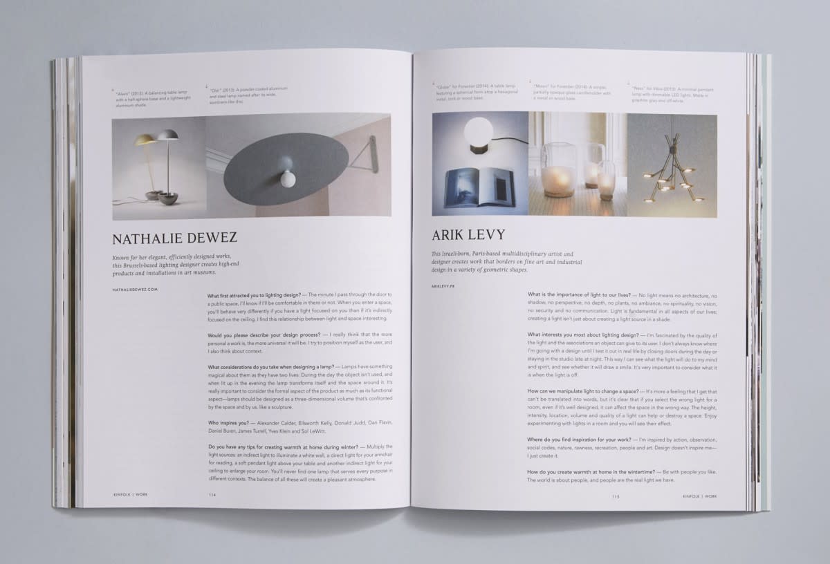
Kinfolk Issue 14
There are many spreads from Kinfolk that I am proud of, or excite me, and perhaps this appears as an unusual choice. However the colours, strong variety of content and marked difference from previous issue designs makes me chose it. There is something satisfying in the small differences between the pages yet clear grid and simplicity that ticks my box.
There are many spreads from Kinfolk that I am proud of, or excite me, and perhaps this appears as an unusual choice. However the colours, strong variety of content and marked difference from previous issue designs makes me chose it. There is something satisfying in the small differences between the pages yet clear grid and simplicity that ticks my box.
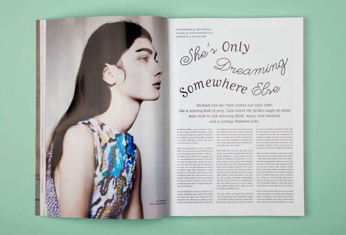
Lula Issue 16
I had such fun with the headlines within this issue of Lula and I have a real fondness for this spread. I’m pleased there is movement and lightness yet clarity and accessibility – something I am often striving for in design.
I had such fun with the headlines within this issue of Lula and I have a real fondness for this spread. I’m pleased there is movement and lightness yet clarity and accessibility – something I am often striving for in design.
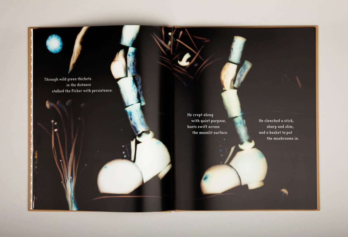
The Mushroom Picker
I love the composition of this spread. The way the image moves up from the bottom right to top left with the type doing the opposite. It's expressive when reading aloud, as one is meant to, being a children's book. This iteration between type and image is important to me – the two parts becoming one entity.
The New Vegetarian
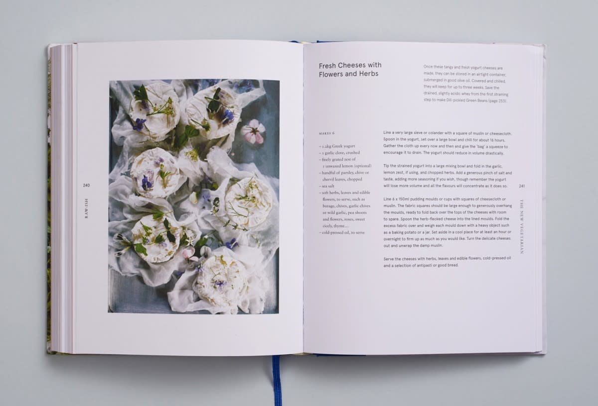
Despite being functional cookery material I enjoy the purity of this spread. I had a lovely close working relationship with the author Alice Hart. There is a feminity to the image which works against the somewhat hard simplicity of the text page. I feel like all the elements are very harmonious whilst small details such as the vertical type and ‘em–based’ ingredients elevate the page.
Despite being functional cookery material I enjoy the purity of this spread. I had a lovely close working relationship with the author Alice Hart. There is a feminity to the image which works against the somewhat hard simplicity of the text page. I feel like all the elements are very harmonious whilst small details such as the vertical type and ‘em–based’ ingredients elevate the page.
Follow Charlotte via her website.