Jer Thorp on making data meaningful
Data artist. Even the term is provocative, its constituent parts seemingly polar opposites, “But I’m fine with that,” says Jer Thorp, data artist, innovator-in-residence at the Library of Congress in Washington and guest speaker at Semi Permanent Auckland 2018. “I want to challenge expectations.”
One of those expectations in the spotlight is data-driven advertising – the largest computational system in the world – which is entirely geared towards selling people stuff. Except it doesn’t work very well.
“It’s a bit of a scam really. We know it doesn’t work very well. “In our work, we’ve found that when it comes to predicting what we want, none of the advertisers are getting it right,” says Jer. “I’d like to see big data instead of being used to make people’s lives better – to help them make better decisions, and to foster understanding between people.”
In effect, Jer wants to unlock the promise and the power of data – information – and share it with everybody, rather than have it concentrated in the hands of a few.
A data artist, for those who don’t know, is somebody who creates visual representations of data in a way that makes a wealth of complex knowledge and information understandable – just by looking at it. In essence, unraveling the secrets of big data for everybody to see.
I liken him to a modern-day Robin Hood, but Jer doesn’t like the comparison at all.
Marginally better, is to think of him and others like him as unlocking opportunities for lots of Robin Hoods to share knowledge and information amongst the masses. For example, community pressure groups may be able to see a visual representation of levels of air pollution over their city, and then use that information to bring about change.
Marginally better, is to think of him and others like him as unlocking opportunities for lots of Robin Hoods to share knowledge and information amongst the masses. For example, community pressure groups may be able to see a visual representation of levels of air pollution over their city, and then use that information to bring about change.
In some ways, Jer’s work at the Library of Congress is a bit like that. He’s currently working on how to make the complexity of data, all that information housed in the library, visually understandable to a visitor who walks in the doors. People can then take that knowledge, those insights, and share it more widely with others – but it’s a power that needs to be used cautiously.
“There’s a fairly old project – but still relevant – during which a group of researchers developed an app that used the data from motorists’ dashcams to log potholes and report them to the city. Essentially, it’s a citizen sensing project that seems to make sense. The problem was that the neighborhoods where people drive with smartphones on the dash are more affluent; their roads less in need of repair, but the data was drawing resources away from the areas of greatest need.
“I am interested in how data, and the interpretation of that data, can be used to reverse inequality, as well as to help a person step into another person’s shoes, for example, to understand how a homeless person’s experience is different to mine – a way to encourage empathy and shared experiences, but it won’t be easy.
“We need to create a new generation of people who understand how data can be used to the advantage of their communities,” says Jer.
One such project he references is The Map Room in St Louis. School children are invited to draw a map of their neighborhoods – the routes they take to school, how they get to school, the places they feel safe, where they feel unsafe, where they live and play.
In The Map Room, the children’s map is overlaid with layers of data. For example, a map made in the 1930s by The Home Owners Loan Corporation (HOLC), which was responsible for rescuing home-owners in the wake of the Great Depression. The red lined areas of the HORC maps – those that would get no help – were almost always African American neighborhoods.
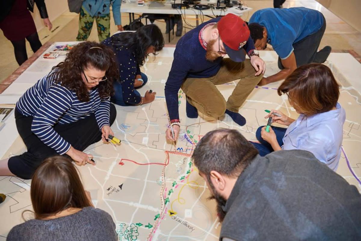
Overlaying the children’s map with the HORC map shows the kids how racists policies from the 1930s have contributed to poverty and disenfranchisement today – the shape of their city in 2018. But there’s other data too, including employment rates, annual income, traffic levels and pollution.
A reporter from the city’s South County Times, Dickson Beall, writes that the Map Room “lets the citizens of St Louis see their city through the eyes of ninth graders, the homeless, bike commuters, city workers, activities and artists”.
Jer says this simple idea of mapping appeals to him as one way to build data literacy and help everybody to a better understanding of our fellow humans. He wants to teach all people how to read, understand and use data – not steal it from the rich to give to the poor, aka Robin Hood.
The challenge, of course, is in leading people to wanting to know and understand and use the data and, hopefully, his work at the Library of Congress will contribute to that.
“I’ve been working with this idea of serendipity. The Internet, for example, is good if you know what you’re looking for. But if you don’t, the Internet isn’t going to serve you so well. Libraries, on the other hand, are very serendipitous because you go towards the information you want, but on the way, you come across other things that are totally unexpected, like the history of New Zealand, for instance – you get tempted by different things.
“I like the idea of a serendipity engine; a way to formalise an idea that allows people to find wonder in the whole library, to ask different questions and be drawn into discovering new things.
“How I design something like that a big question all of its own. I’m talking to people who work in the library, I’m looking at the collection and sketching some lightweight ideas of what I’m thinking about – it’s like glimpsing something out of the corner of your eye, knowing that later it will arrive at your doorstep.
“The common thread is forward motion. The only thing I can do is keep moving."