Gone in 60 Seconds

As the final part in our interview series with title sequence designers, we spoke to Patrick Clair of Elastic…

"There’s no visual in the world that’s interesting enough to sustain people’s attention for more than 60 seconds.”
Patrick Clair
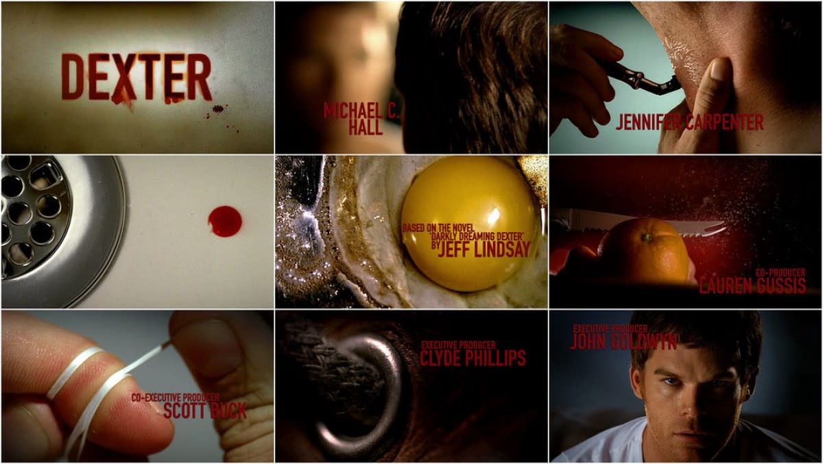
“I think about my favourite title sequences and they always come back to something that can be summed up in a single sentence: Mad Men, you say it’s a man in free fall. For Dexter, it’s the brutality of cooking breakfast.”
Patrick Clair
“We trawl through blogs, the Internet, art books, photography books, and try to get together mood boards that we feel evoke something related to the show.”
Patrick Clair
"Title sequences are in some ways more important than they’ve ever been."
Patrick Clair
In an interview with Art Of The Title, Patrick spoke of different visual aesthetics that informed the Halt and Catch Fire title sequence – everything from retro video games to sex ed videos. Patrick and his team clearly pull from a wide range of disparate sources, begging the question: what’s some of the more outlandish reference material they’ve used?


"I think we’re incredibly lucky to be living in a time when physical location matters far less than talent and dedication."
Patrick Clair
“I tend to think that financial limitations drive creative innovation and that pressure is actually where we get cool new ideas, and cool new approaches from."
Patrick Clair