Rebranding Semi Permanent
It’s been 14 years since Semi Permanent was born out of concrete coloured, loop pile carpets and envelopes of cash handed over to cover airline fees. In that time, it’s grown between venues, capital cities and countries.
This latest rebrand, at first, seemed to be a simple shift in logo. However, one question led to another, and eventually deeper questions of who Semi-Permanent is, what it stands for and what it could be emerged out of the process. The process of change involved challenge, confronting of truths and navigating the tension between permanence and adaptability. Mainly, it involved a heap of hard work and thought to come to where it is today.
While Semi Permanent is known for its diverse speaker line-ups, focus on design and fanatical approach to curation, the design of the first logo was surprisingly low touch. The first rebrand was approached in the same DIY spirit as the rest of the enterprise – owner Murray recalls literally scrolling through fonts until he found one he liked. He chose Clarendon, made some tweaks and found the new Semi Permanent logo.
“We initially thought the rebrand would only take a month”
Murray Bell, Semi Permanent Director / Founder
After re-imaginings by Nick Rudenno from NoWhere Famous and Moffitt Moffitt across the years, the next examination of the logo was prompted by co-owner Andrew’s exit in 2014. Another examination of the logo was due. It felt like it didn’t encompass the full picture of the brand’s identity, or at least was discontinuous with where the company was heading. At first, Murray only looked at a few minor logo changes. As so often happens with rebrands, these quickly opened up into a daunting set of further questions. Why are we doing this? What’s the underlying philosophy behind Semi Permanent? How does that affect our mindset? And how does it affect how we think about our potential?
WHO WE ARE
Answers to these questions came from a strategic look at Semi Permanent, where it could be and what it’s potential is. The reason why was always the audience. To share and inspire people in creation. The underlying philosophy? To educate and inspire. The potential? To stretch beyond a yearly event, and provide a conversational channel for all kinds of content and inspiration. And the challenge? To maintain this identity while still being flexible enough to change direction.
WHAT DO WE LOOK LIKE
These decisions filtered down into the way the brand was spoken about, the selection of who to work with, and the graphic design and art look. Enter creative director Jamie Mitchell from M35.
At first, he was tasked with evolving the brand without changing the logo and the necessity of updating all the assets Semi-Permanent already had. However, as the enormity of the task revealed itself, this brief expanded. It was now not a simple logo design, but a new language system entirely. The gem of the thematic idea began in that year’s event. 2014 was a retrospective. The idea of Semi Permanent’s legacy sparked off the concept for the logo – one that reflected the depth and breadth of the event.
“It was going to be a challenge, and I told Jamie (Mitchell) as much”
Murray Bell
By 2015, the strategy on the brand was finished, as were the pillars and core values. The design process began in earnest with a long period of sketching out various ideas, in trial and error continued. After a few iterations made it through the culling, testing on different places and locations began. As any designer will tell you, logo design nowadays has to take in a variety of applications, and work at a variety of touchpoints. How does it look on a website? On a billboard? On a business card? On a email signature?
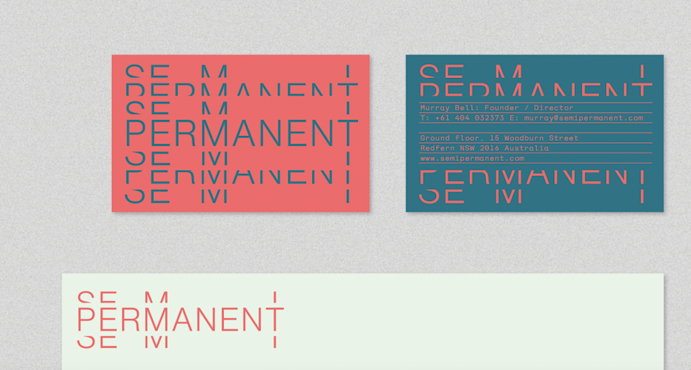
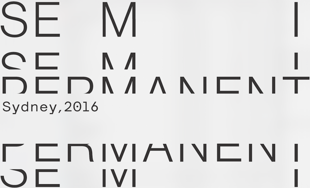
There was such confidence in Jamie’s first solution that he only presented one to Murray. It opened and closed to thematically reflect the depth and legacy of SP. It had a rhythm and replication to it.
The opening and closing motif were loved. However, the sticking points were on form and on the weight and spacing on the text. On the legibility of the text. And whether it would work for clients and partnerships.
HOW DO PEOPLE KNOW US
While this was happening, Marty Wirth and Russell Privett at Present Company were brought on to re-assess the user experience of the event. They were tasked on how Semi Permanent could inspire and enable, and how they could use their enormous bank of material accumulated after such a long history of events. They started initially with quantitative surveys. Conducted by willing students at General Assembly, they consulted everyone they could find in creative endeavours, from art directors to creatives, upon their experiences at Semi Permanent. The results came back as a bit of a shock. Semi Permanent was viewed in the middle of the experience scale. It works as an event, and delivers on expectations. However, it didn’t surprise, excite and blow people away.
So they delved deeper into these issues using a smaller sample base of qualitative interviews. What came out is people want a tangible payoff. They want to walk out of the conference having been upskilled. There was also a lack of mentorship available in general in the creative community. Therefore, the program for the year’s event focused on giving you, the audience, more of this. Workshops with NIDA to work on your presence in the room and talks on mentor relationships grew out of these results.
The re-design of the website was also influenced by this. After an exhaustive look at popular websites and their structure, as well as the audience’s comments on what they enjoy, the three pillars of Design, Business and Culture were broken out. It was at this intersection where Semi Permanent lay. The new website became the spot in which the motto of Semi Permanent, to inspire and engage all year round, was realised.
“It was about needing to build this out to evolve”
Russell Privett, Present Company
Meanwhile, Jamie was ready with his second version of the logo. They ended up with an execution that looked more minimal, legible and distinct. It was recognisable without being overpowering. Jamie then developed a visual language out of this. Parts were collaborative. One red hue was selected by Murray on the basis of a Nike shoebox he’d accumulated as part of his travels.
HOW DO WE MOVE
Once this had been done, it was a case of breaking this static logo out into movement. On the recommendation of Patrick Clair and Raoul Marks, Mike Tosetto was asked to create a moving identity. When Mike saw it, he thought it looked transient. So he started “jamming” with a way to bring it to life. Flicking between 12 frames and 24 frames, changing curves and speeds of movements, and rendering out iterations that looked like they had that “punchy, snappy, slinky-like action.” By sending the templates to Murray who would experiment himself, they ended up with a minimal option that expanded to show the depth and history within the brand. Joe Franklin from Onic created a jumpy, organic, pattering sound palette, the sound identity and brand video was born.
The end result is really only a first step towards a realisation of these goals. It’s a brand less about a uni-directional conference, and more about a two way conversation between audience and brand. It’s a brand identity that can live for at least 5 years, recognisable but able to survive in a permanent state of beta. A constant state of existing while under shift. Really, Semi Permanent had probably always been aimed at that, from the inception. This process just might helped uncover it.