Unpacking the Semi Permanent 2022 Opening Titles
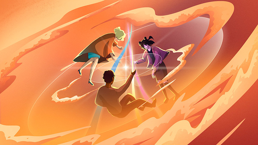
Every year, Semi Permanent collaborates with a director or animator to create a bespoke opening title sequence for the annual festival. These titles serve logistically to introduce the speakers that will appear on stage over the subsequent days, and emotionally to communicate the overarching theme of the event.
This year, we worked with PJ Richardson and Monica Reimold of Californian design and animation studio Laundry, and here, Richardson shares the creative process and concept of his spectacular piece of filmmaking.
What was the concept behind your opening credits for Semi Permanent 2022?
About two years ago, like many, we were feeling the panic, the stress on mental health and anxiety of the complete unknown of the worldwide pandemic. We questioned how we not only exist in this new normal, but thrive and push ourselves creatively. The theme of coming together as an artistic community, even while remote and digital, was a fuel that we were all craving as creatives and was a kernel of an idea that stuck with us.
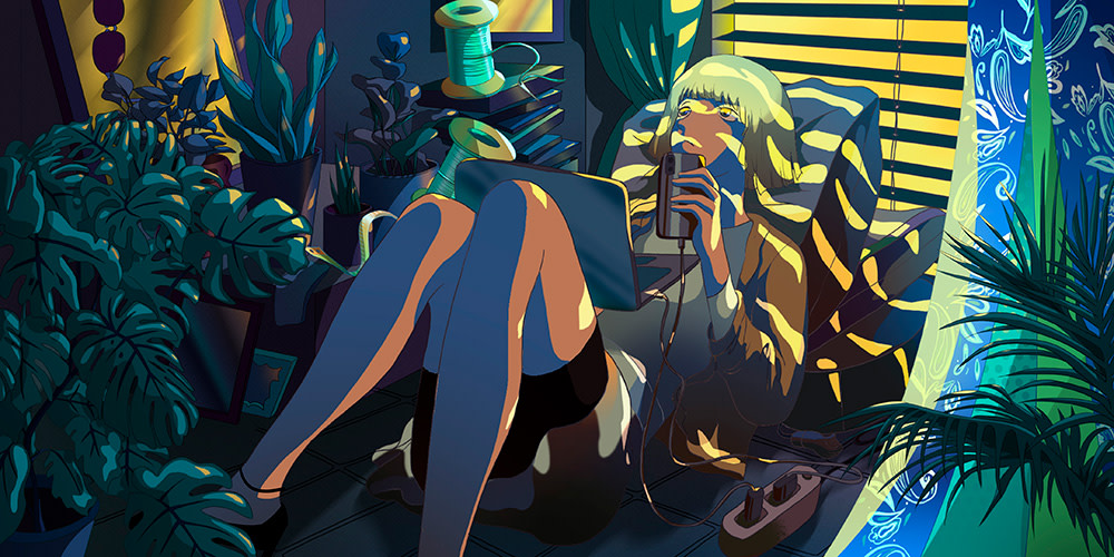
Fast forward to Semi Permanent 2022. We quickly reflected on what the festival means after this lockdown differently than before. We explored the idea of perspectives, and the concept of using all the hard times we encountered to fuel coming together as a community any way possible became the storyline.
The isolation. The creative block. And then, coming together online, at first. Then letting the warmth of community inspire each of us to push creatively, weirder, bigger, in new ways each of us never even considered. It is both symbolic of the past two years at home yet together, but also a quite literal representation of coming together in person now, in Sydney, after so long.
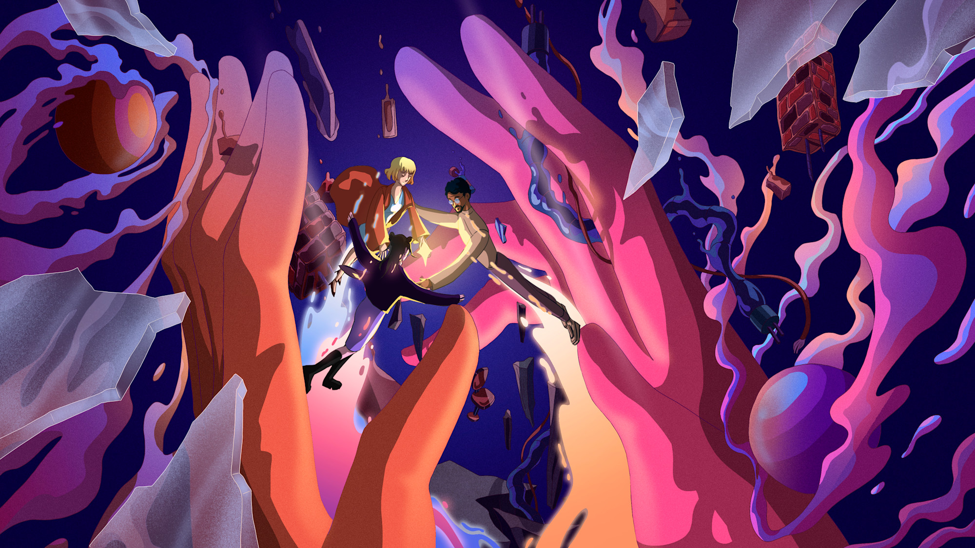
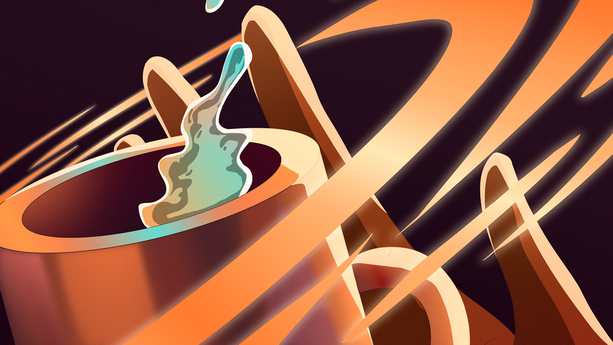
From the get go, talking with the Semi Permanent team, the theme of perspective came up. We concepted this so many different ways, and what came of it was that perspective is about embracing the difficult. Visually, that was about turning those little screens in each of our rooms into catalysts to seek out connection. And building on the line theme from the branding, assigning a line to each character as a thread to follow, but like a braid, come together as one. And empower viewers to do the same.
From a pure title sequence level structurally, we also wanted to reexamine even what a title sequence could be, whether for conferences or films. At its core in this context, it is about getting the audience inspired and excited as one of the first things they watch at Semi Permanent. So instead of making it about the names outright, we wanted to hook them into this emotional and beautifully surreal story, then have the speakers be the credits to this narrative.
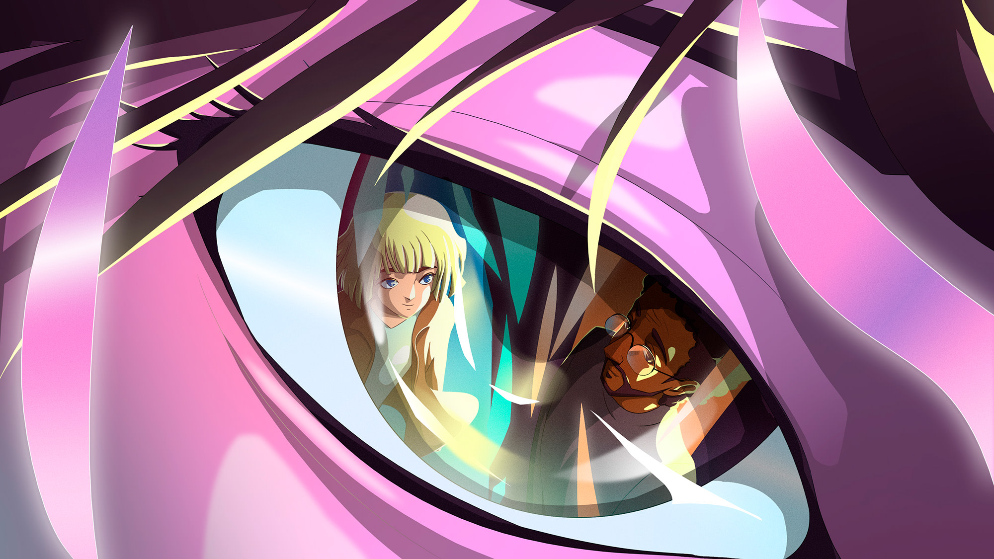
How did you develop and execute this considering the sheer amount of detail and intricacy?
I wish it were more complex, but one of our lead illustrators on the project has an intricate illustration style full of beautiful and abstract dimension and an incredibly vivid sense of lighting with how she illustrates.
The challenge was crafting a narrative yet leaving room to get more surreal and like the world is losing its hold on gravity. That can be difficult to illustrate, because abstraction is hard to explain and justify. But what helped us tremendously was to storyboard out with sketches the majority of the sequence. We actually had our biggest team on this portion early on. It gave us room to question, elaborate, re-arrange and even kill some shots that didn’t serve either the story or the clarity of it.
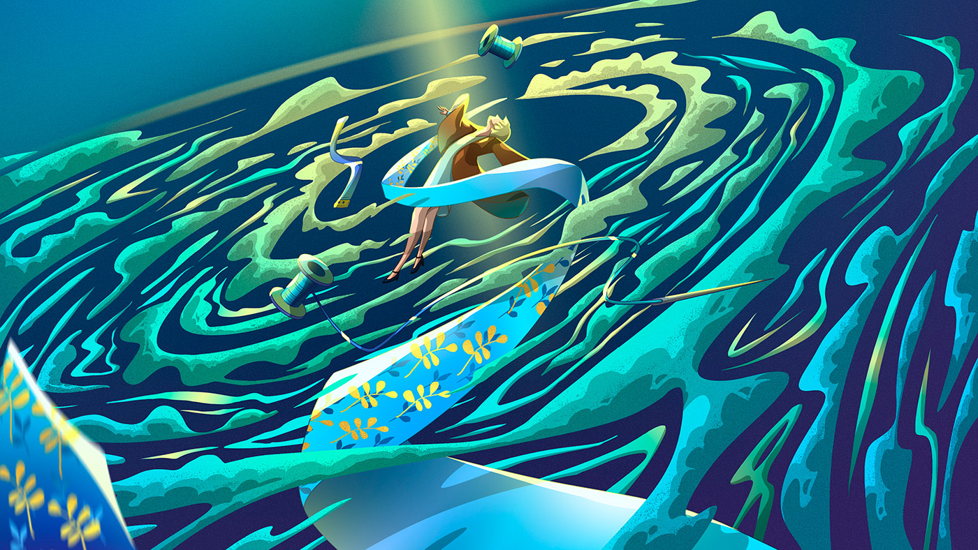
The characters are so emotionally moving – what was your intention with the characterisation?
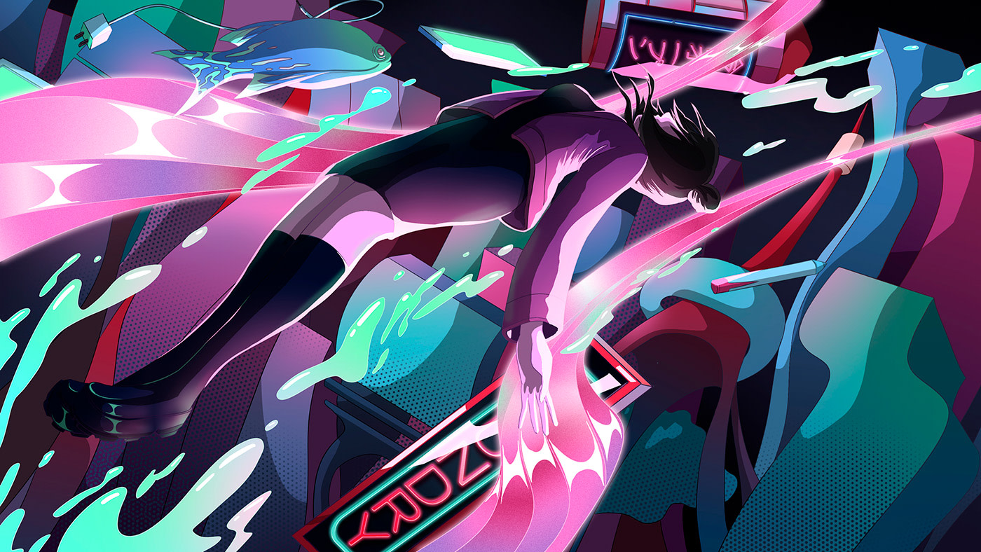
It’s a really delicate balance with illustration. No matter what the intention, in this case a very epic, emotionally and empowering feeling, illustration can still look cute and juvenile, which kind of takes over the emotion and a way we aren’t intending. Because of that, we truly aimed for very specific, almost anime style renderings to bridge the gap of approachable but also elegant and aspirational.
To take it a step further though, it felt like no matter who you are, where you are from, or where you are watching, we should speak to the entire world of creatives. That truly is what the pandemic taught us. We could come together, better than ever as a worldwide community with friends new and old anywhere on the planet.
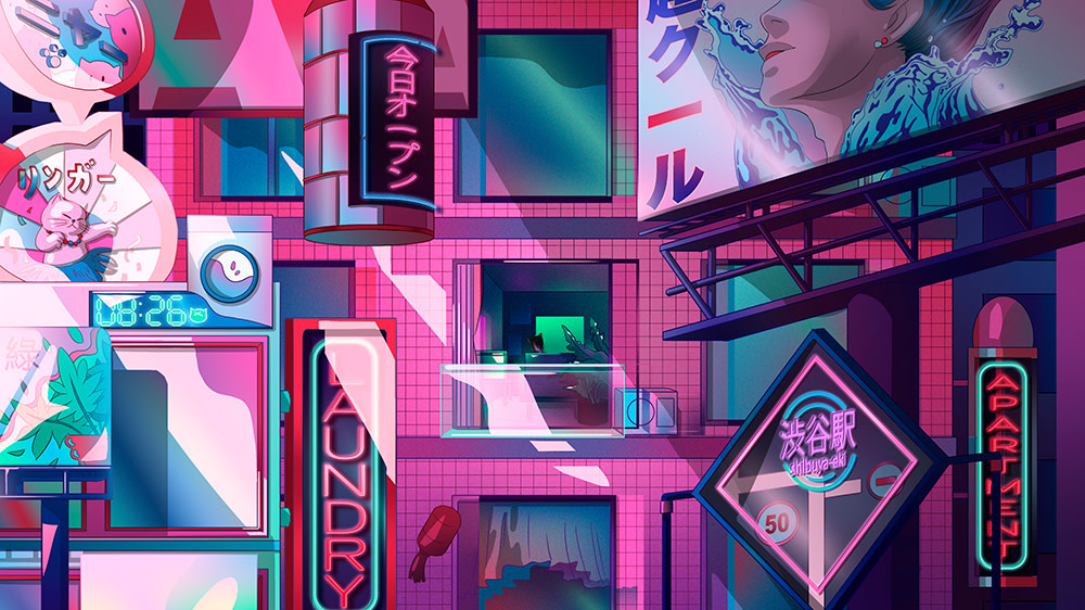
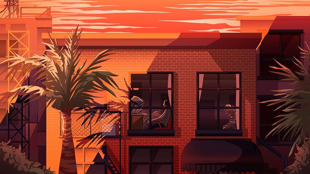
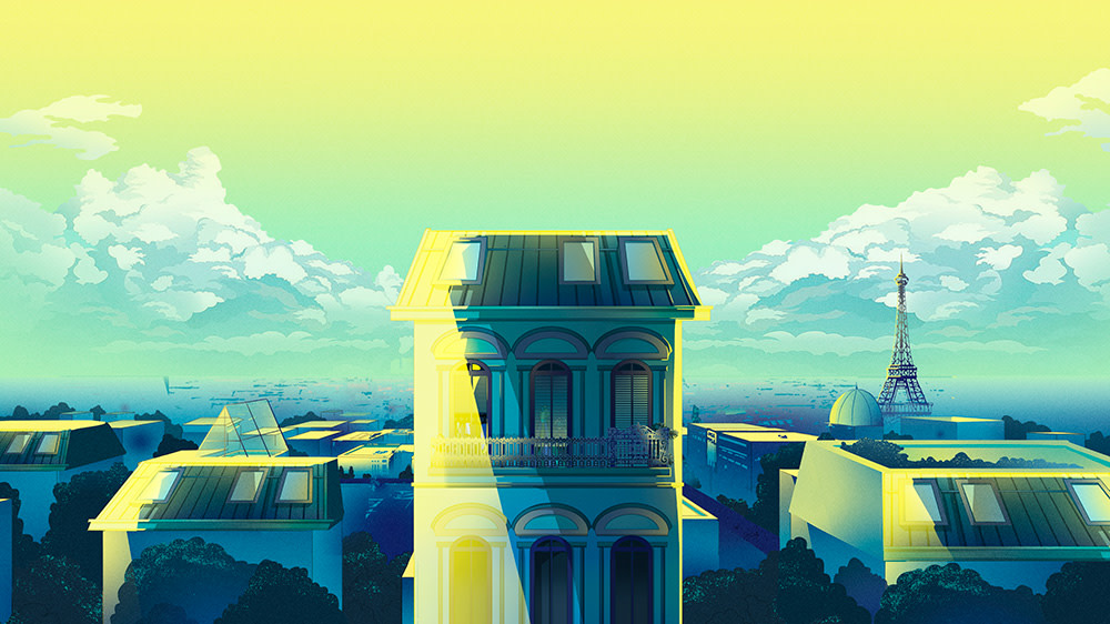
To convey that, we created very specific characters and background stories. One is a filmmaker from Los Angeles. Another an avant garde fashionista and designer from Tokyo. And the third, an up-and-coming fashion student in Paris. It also really drove how we illustrated each location in a very specific way. From the type of room, what would be in it, to the type of color and even the shape and size of each location. Even how the light works in each place was very specifically different.
What is it that's key to convey in a title sequence?
There’s so many ways to do it. I’ve seen a tremendous amount of very successful abstract sequences as well as more literal ones. I think the key is creating anything that reflects the context of what it is for. For a film, it's often about creating a little bit of anticipation if at the beginning. Or for end credits, it’s about leaving the theatre pumped as they walk out. If for a conference, we think it is a little different. It is about lifting the feeling of excitement in the room in some way. Very often, the music is the huge secret ingredient to do that. Luckily our editor pulled a superb reference track. And our longtime collaborators from Combustion Studios really took it and built on it in a huge way that made us feel like we were looking into a window of an entire world of visual imagination.
What does working on a title sequence offer to you creatively that is different to other projects?
We try to use titles as a platform to push styles and concepts much further visually and emotionally than our traditional clients let us. To be honest, we’re also just huge design fanboys and girls so that never hurts to put a pretty picture under some of our biggest heroes.
What's your favourite element of this work?
The colours, music and story. But working with our team day and out was the most rewarding part. Everyone from illustrators to animators to creative directors to producers all had an even dialogue to discuss, push, pull and keep enthusiastically making this kernel of an idea that challenges traditional titles in such a cool way.
Lastly, not a question, but a huge thank you to the Semi Permanent team. You guys had a concise starting point of what, where and how you wanted this to land that was such a perfect jumping off point to find this unusually unique way to get there. We are humbled and incredibly grateful you considered us for this dream project.