The heavy metal world of Mandy
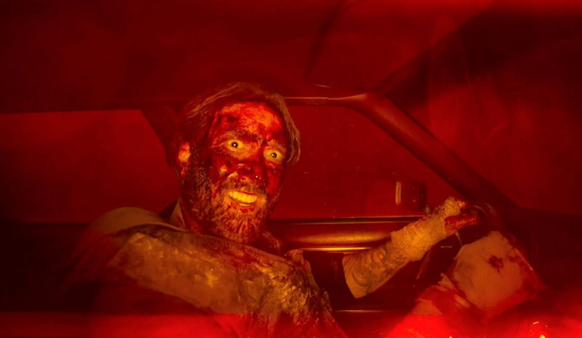
Not just this year’s best revenge film (in which Nicolas Cage fights a crazed sex-cult and LSD-gulping demon-bikies), Panos Cosmatos’ Mandy is a bubble-bath for the senses; a miasmic fever-dream of saturated colours, textures and lens flares that draws you deep into its mystic world (and never lets you go).
One key-hole to this world is through its titles; intricate placards that play throughout the film as a narrative device as much as a design one. In this sense, its graphic design with a vengeance — a kaleidoscope of references that draws from deep within the bowels of heaven and hell in equal measure. Richard Kenworthy and the Emmy-nominated team at Shynola designed the lot — here's how they did it.
Warning: Mandy spoilers to follow.
SP: The beginning is usually a good place to start. How did you come to be involved with Panos and the film?
Richard Kenworthy: It was a strange alignment of the stars. We had seen [his prior film] Beyond the Black Rainbow and it had certainly left a lasting impression on us. At the same time we’d become friendly with Aaron Stewart-Ahn (who wrote the screenplay with Panos) through social media, just out of mutual respect and admiration. At the same time, Elijah Wood had contacted us asking if we’d make an animated ident for his production company SpectreVision, which we gladly did. So I think when they were discussing the titles, Panos said he loved the SpectreVision thing and wanted whoever had done that.
What was the brief from Panos on the titles? They play a really interesting role in the narrative of the film, so I imagine they were of priority to get right.
Well it’s certainly unusual as there are three cards in total, and only when we get to the third is it the actual title of the film (Mandy). They’re much more like chapter headings in a way… as if the cover was in the middle of the book!
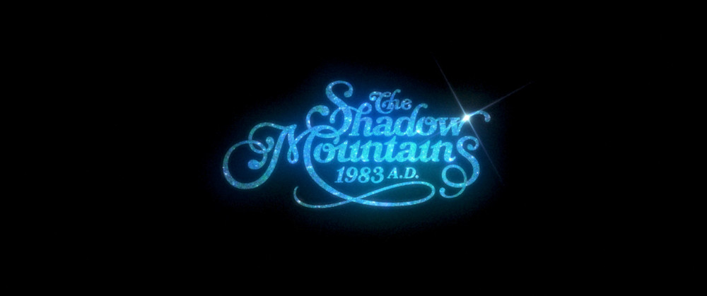
We were initially sent a cut of the film without knowing too much about it. I was watching it firstly as an audience member, but secondly looking out for the temp titles so I could see exactly where we fitted in. So when the first title card came up I was like ‘wtf? Shadow Mountains? That’s not the name of the film!’
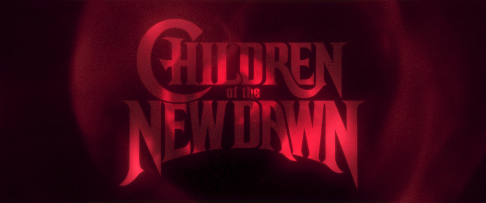
This was compounded by the fact that the first temp card was really bold and large, and felt like the title to some 80’s Bruce Willis trash. Quite jarring. That was the card which changed the most as it just didn’t feel right to us. The temp Mandy card was just a still, but you could easily see how that one should be done. Oddly, the hardest one to do was the ‘Children of the New Dawn’ title, because the rough temp the editor had placed in there was so nice. It was hard to shake it off or better it.
There wasn’t really much of a written brief. Instead we watched the film, had some thoughts, and then Panos and I talked about those ideas — what he wanted them to achieve, the mood of them, we shared references with each other and so on. We were on the same wavelength as Panos so it wasn’t a difficult birth at all. In a way, that the titles are so interwoven into the narrative made the job easier since each had a definite, individual role, and a definite moment to slip into. As we made them we constructed them within the edit, so we could always see them in context. It felt like there was a right answer to work towards.
Tell me about the research process. What did Panos give you and what did you bring to the fold yourself?
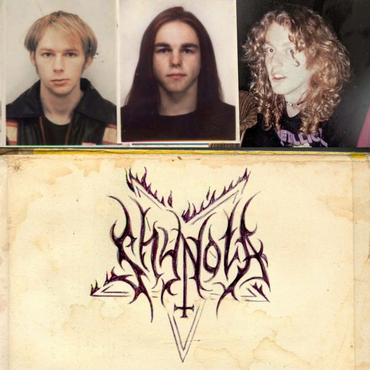
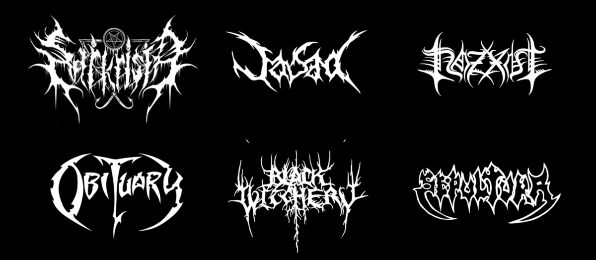
For the main title we did zero research because we didn’t need to. We were all metallers in our youth and grew up reading the comics and watching the films from the exact same well from which Mandy is drawn. We lived and breathed that stuff.
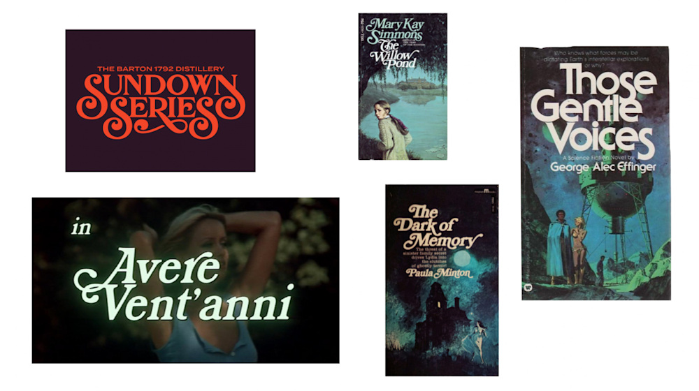
The ‘Shadow Mountains’ title was the one we spent the most time researching. We wanted it to feel like that idyllic, late 70s, apple-pie, groovy, iron-on tee, lettering. Like a tee that Red might own, but mostly because at that moment in the film he’s returning home, to their little cave of bliss. It just felt right that it would be curly, warm, friendly and familiar. So we looked at a lot of curly graphics from around that time, mostly Herb Lubalin and his contemporaries.
We wanted it to feel like that idyllic, late 70s, apple-pie, groovy, iron-on tee, lettering.
Richard Kenworthy
How did the process for designing the titles progress from there?
They were all done digitally eventually, but I always start on paper as I find that is much easier to get a feel for the letters. I rub out and redraw over and over and get to know the letters and their problems intimately. It’s more immediate and quicker to revise I find. It’s a hard process to describe as it is part instinctive and part practice, but you keep chiselling away, trying things until it feels right.
For me, working on paper gets me to the point where I feel ready and know what needs to be done, and only then do I go to the Wacom. And even then I work rough, by hand. I never start with splines as I hate them. Instead I’ll sketch out letters and keep hacking away at them until they are right and then refine them later with finer sandpaper.
Each title card went through many iterations until they felt right. It was useful to have three very different cards to design because I could park one and concentrate on the next, so by the time I came back to the first one any issues with it were really glaring. The ‘Children of the New Dawn’ card was the quickest as that was a bastardisation of a great font the production department had found for artworking props. It was really on the money and so a really great place to start.
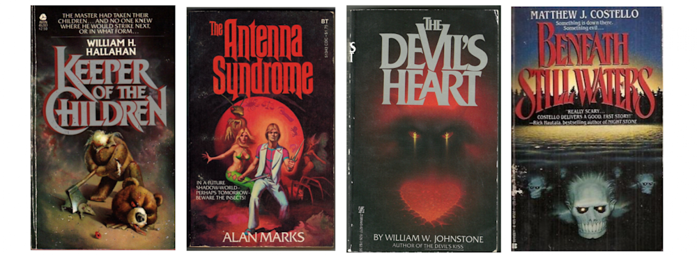
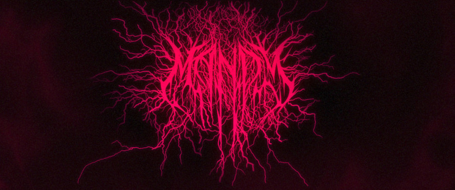
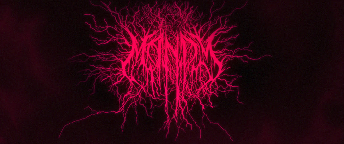
The hardest one to design by far was Mandy. Not because of the style, because we knew it well, but because of all the things it needed to fulfil. Originally Panos had commissioned Christophe Szpajdel, a renowned metal logo designer to come up with the logo. It was fantastic but by its nature hard to read - which of course puts the willies up the producers and distributors. So the brief was do make something in the same vain, but where — at least momentarily — it was legible.
You’re fighting how a computer wants to make everything perfect for you at every turn.
Richard Kenworthy
That last part was hard enough in itself — that it would momentarily be legible — because it had to grow organically and be bookended by illegibility. But then in addition Panos wanted it to be somehow symmetrical, which the letters M-A-N-D-Y don’t really want to comply with; that it should be very vaguely heart shaped; and that it should have hundreds upon hundred of vein-like tendrils. That all animate.
From a boring practical perspective it was hard to break that down so that all three of us could work on it simultaneously, but in the end that turned out to be very useful; by creating each letter separately, and breaking the veins into sections, meant we could choreograph everything at the end and control the legibility. You get perhaps two seconds before it goes crazy.
Panos [the director] wanted it to be somehow symmetrical, which the letters M-A-N-D-Y don’t really want to comply with; that it should be very vaguely heart shaped; and that it should have hundreds upon hundred of vein-like tendrils.
Richard Kenworthy
How did you get that uniquely 80s look and feel in there with modern software?
That’s all pretty easy stuff since there’s a glut of references to emulate. Mostly you’re fighting how a computer wants to make everything perfect for you at every turn. That and not allowing the computer to help — everything has to be artworked by hand and the animation key’d frame-by-frame.
Did you experiment with any new forms or styles compared to your other title work? Any challenges or road blocks?
We approach every project differently and look at it from a problem-solving, designer point-of-view. What does this project or moment need? What is it we are trying to say and, more importantly, what do we want the audience to think and feel? We’re always in service of the story and the director’s vision of the project overall. That way we’re writing ourselves a brief, the answer to which will play a part in the film or show. So Mandy isn’t anything like Glow, and Glow isn’t anything like the IT Crowd nor Scott Pilgrim or anything else we’ve done. To us it would be a complete failure of our job title if they were alike. We get to be creative and add our own taste to every project, but we’re not here to plant our own flag.
How does a project like this fit into the aspirations of Shynola and your more commercial work? Do these smaller projects allow for experimentation to feed into the bigger ones or vice versa?
It used to be the case that we would get to be creative and experimental and do more original and interesting work in music videos. For a multitude of reasons that is no longer so viable anymore, which is of course a shame. By chance we’ve found ourselves being approached increasingly to work on titles which feel like a close relative. There’s a lot of freedom and plenty of scope to try new things.
What’s next for you all?
We recently completed a new title sequence, which also acts as a prologue, to a new adaptation of Watership Down which is released this Christmas. It’s all told with shadow puppets and despite its very simple, graphic look was actually deceptively difficult to orchestrate. It’s a million miles away from Mandy. We also have a great piece for Maserati which is in the wings waiting to be released.
Can you talk about the films you’re producing at the moment?
We’ve got two features in development, one I don’t want to give away, but the other is an adaptation of Matthew De Abaitua’s The Red Men. We’re developing that with Warp Films and the BFI and it’s a science fiction film set in the here and now in Hackney, London, where we’re from. We shot a short film as a teaser for the project call Dr. Easy which you can watch here. From our perspective the film industry works at a glacial pace, which is quite frustrating for us as we’re chomping at the bit to direct something. Fingers crossed.