Semi Permanent Auckland titles
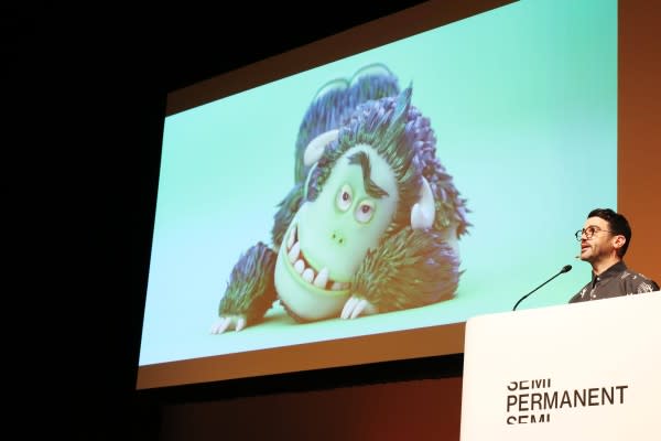
MPC’s Marc Smith rummages about in his “great ideas never realised” folder and finds a furry friend to take centre-stage in the title sequence for Semi Permanent Auckland.
Yet(i) again
The design of the Semi Permanent title sequence is a tradition that comes with tangible pressure. Getting up on to the Semi Permanent stage to deliver a compelling presentation about your life in design might be daunting enough for some, but one lucky soul also receives the honour of developing a title sequence to launch the festival in front of a 1500-strong design savvy audience and a cohort of the best designers in the business.
Semi Permanent Auckland curator Simon Velvin this year, gave the title design gig to Marc Smith, a New Zealand born and bred creative director who works with countryman Alan Bibby at MPC in New York City. Smith and Bibby’s dual talk at SP this year was themed around the emotional spectrum behind successful design and terror as motivation. Given their output, which ranges from music videos for Rihanna through to an advertisement for SF, an electric car maker who didn’t actually have an actual car when MPC made the promotional TVC, it’s hard to imagine they’d be fazed by anything, but that’s not necessarily the case.
“When I was offered the opportunity to not only present at this wonderful conference, but also to design the main titles I decided, hey, why not add to the enormous fear and pressure of presenting by talking a little about the titles I had taken on,” Smith says. “There was a very real chance they might suck. I know the Semi Permanent titles are a prestigious and coveted opportunity. If they did suck, I would be offering myself up for criticism and ridicule by the community I love. I could almost hear people saying, ‘You could have done anything, and you made THAT?’”
Smith and Bibby do a great line in droll, self-deprecating, bone-dry humour. (In fact, they reckon they’ve “weaponised” it, turning to advantage the fact that no one in their NYC studio knows whether they are joking or not.) On LinkedIn, Smith rolls with the moniker “Marc RHYTHM-SECTION Smith” and at SP he recounted one of his favourite comedy stunts of all time – which involved a navy pilot using a billion-dollar jet to draw a suggestive graphic in the sky above Washington.
“There was praise and condemnation – personally, I thought it was the single coolest, most irreverent, childish-yet-technical dichotomy of a thing I had ever seen.”
It’s safe to say that Marc Smith’s title sequence was never going to take itself too seriously.
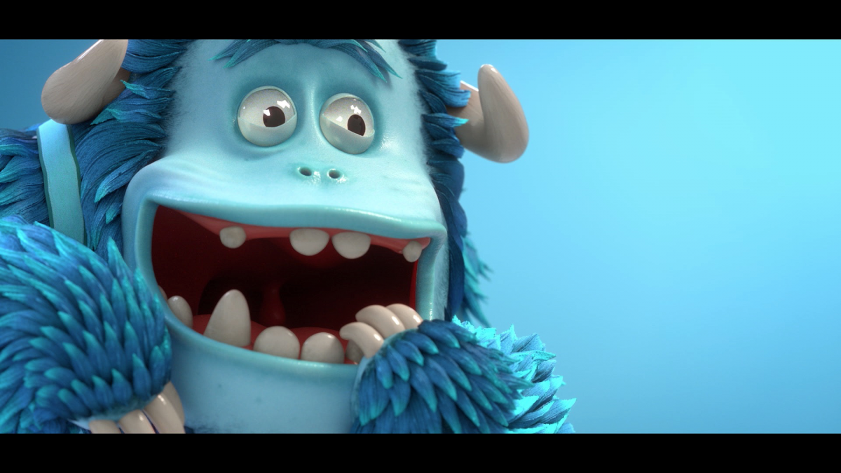
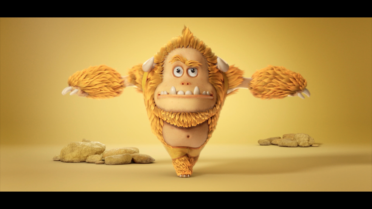
“I titled the piece ‘A roller-coaster ride of emotions’,” he says. “I wanted to create a sequence with levity – a fun and lively character piece that was very me, with a wild spectrum of enthusiasm and emotion. This little dude loved discovery and community so much his face would literally melt. This was not going to be a po-faced, art-house think-piece on the deeper semantics and semiotics of modern design. It's mostly yeti-related dick and bum jokes, because I am a baby and dick jokes are funny. It was a chance to follow-my own advice, not take myself too seriously and fall back in love with design – and specifically with character work, something I adore.”
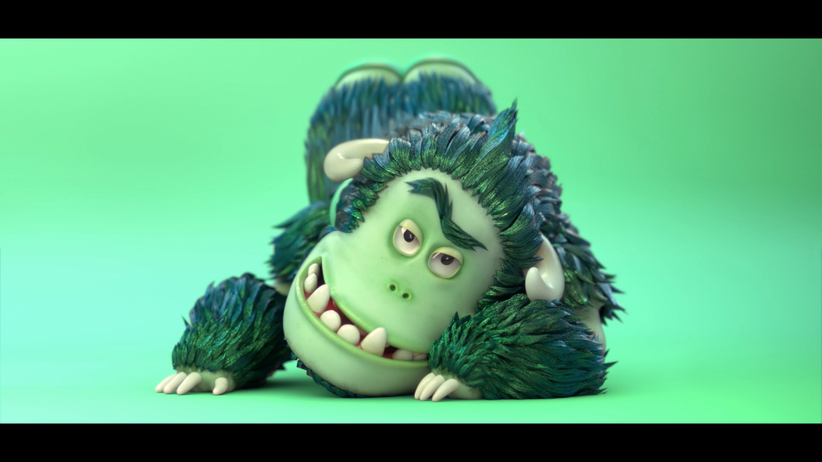
To create the title sequence, Smith resurrected an unrequited love – a friendly yeti kitted out with too-tight shorts, jandals, blade shades and an Aotearoa-shaped tattoo.
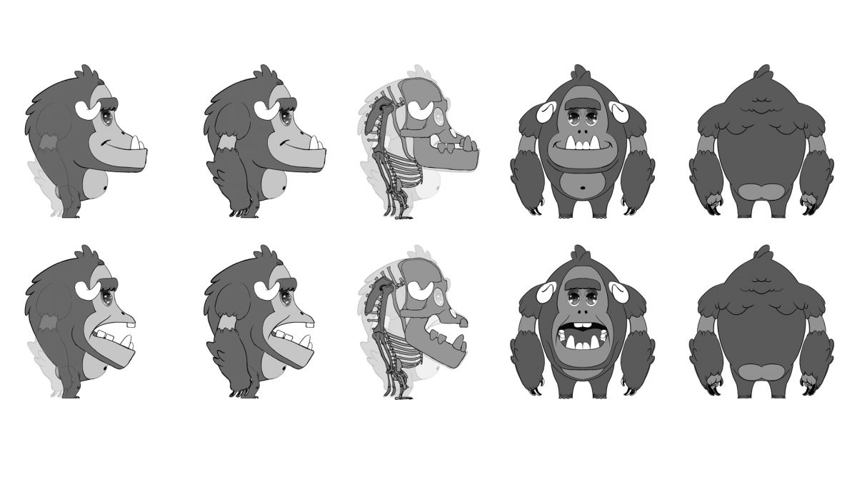
“I directed a job last year for Microsoft's US Christmas campaign. We designed this little yeti-like character that I felt an affinity with. Then he was cut by the client. I never quite got over it. The opportunity to resurrect him for this was something that felt right. I felt a connection, and this was the right venue for something with some levity and some color. It’s really all about community, the joy of discovery, and love.”
In the SP titles, the yeti butt-scratches, pirouettes, struts and shakes through a heavily saturated animation with a cool slow-motion effect that stretched him out through time and space like a Play-Doh through a spaghetti maker. It goes without saying that the title sequence required some leaning on studio resources – “Getting this task underway employed arguably my best skill – being a competent bullshit artist and selling my bosses on an idea so dumb and really expensive to make,” says Smith.
There were some firsts, too, including memorable conversations about the appropriate scaling of a yeti’s anatomy.
“There were so many things about this that would never get commercial sign-off. An agency producer is never going to contact you and say the client requests the yeti's junk be bigger and have more weight to it – so we did it, dammit.”
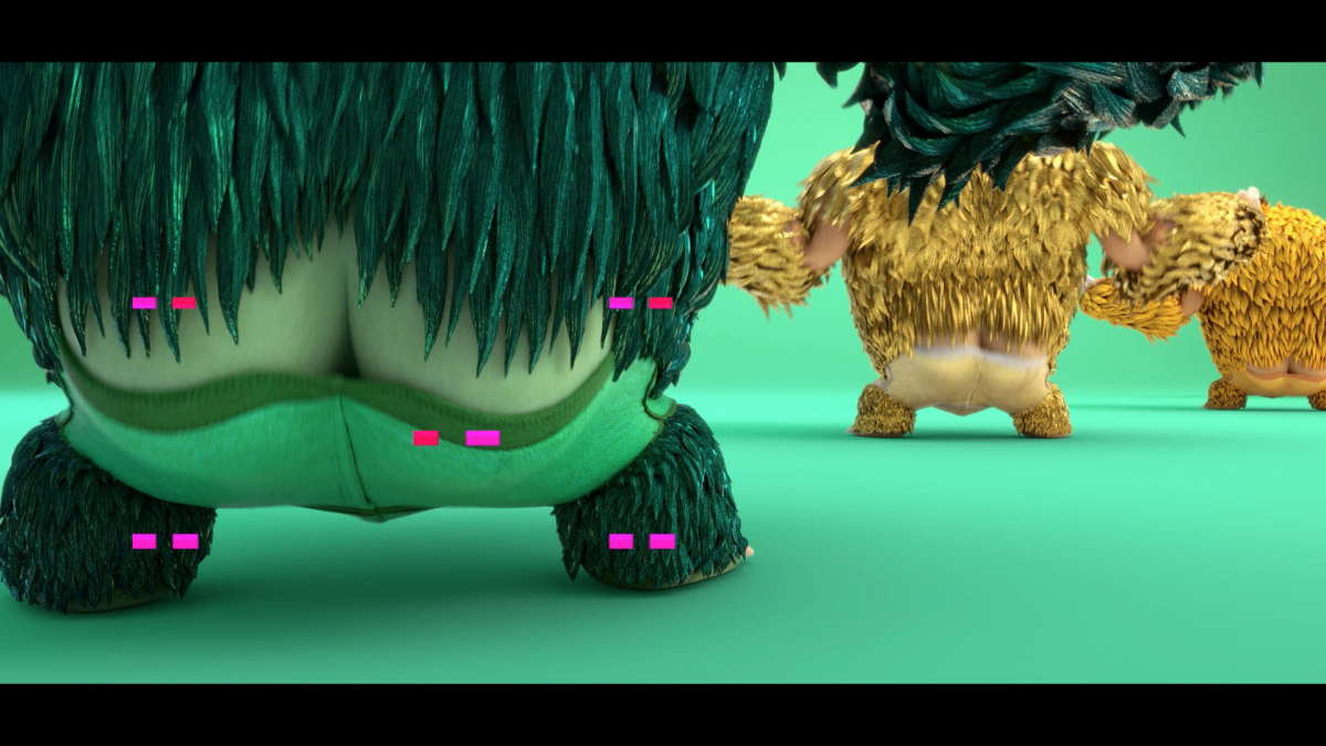
“We went back through the design process, building out his personality, quirks, textures, form, rigging, motion and all the miniature and granular detail that character animation often requires. I made a curated playlist for the animation team so they would understand the tone. I acted out all the scenes personally so the various team members around the various offices had clear references. When you’re a 42-year-old man and you've just had an hour-long meeting with a team of expensive professionals about the correct shape of a yeti's taint, then that's when you know you've made it.”
“People who like me might say I’m in touch with my childlike joy and wild appreciation for life. Critics might say that I’m an immature idiot, but one thing was true throughout – my team and I laughed every day making this. It was a joy to craft this ridiculous clip, and as a personal experiment of letting go, and doing something we love for the sheer joy of it, it was a success. My sincere thanks to my team of collaborators at MPC, and shouts to Nylon New York for working on the music. Love is a bit of an adventure. You never exactly know where your gonna end up. That’s why it’s an adventure.”