StudioFestivals

An interview with Paula Scher
An interview with Paula Scher-1
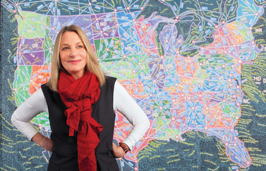
Paula Scher

We’re not afraid to say Paula Scher is one of the most influential graphic designers in the world. In fact, we insist on it, so ahead of her appearance at Semi Permanent Sydney 2018, we gave her a call to get some advice...

Hi Paula! What are you working on at the moment?
A lot of things! I’m working on a new theatre called the Quad Cinema that has four theatres, where we’ve done the identity, the environmental graphics, the awning, the digital media in the back; not just environmental graphics but the architecture and the interior design. It’s been great. And we’re working on the identity for the New Jersey Performing Arts Centre, for Pier 55, for the Pasadena Playhouse, on about five parks... a number of environmental graphics projects.
When you say parks, does that mean you’re designing parks with architects?
I do a lot of environmental graphics and signage. So I collaborate a lot with Field Operations. I do a lot of work with architects, and a lot of graphic design for them too.
What’s the vibe like in NYC right now?
(ed. note: this interview was conducted shortly after the announcement of Trump's international visitor ban). 
Everybody’s miserable. I don’t know anybody who voted for Trump. I’m sure a lot of people did, but I don’t know them. Sometimes, like right after the election, if you saw someone you hadn’t seen for a while you had to vent about it, now we just sort of walk around and pay attention to what we pay attention to and go out and protest when we want to. That’s more or less the climate, but that’s New York. I’m sure the West Coast is the same. I went out to LA recently and everybody seemed to be behaving that way too. But there is this big middle of the country, and they’re different.

"I look at things that exist now and things that exist in history, then I work with my team to work up what we think is possible."

Paula Scher
An interview with Paula Scher-2
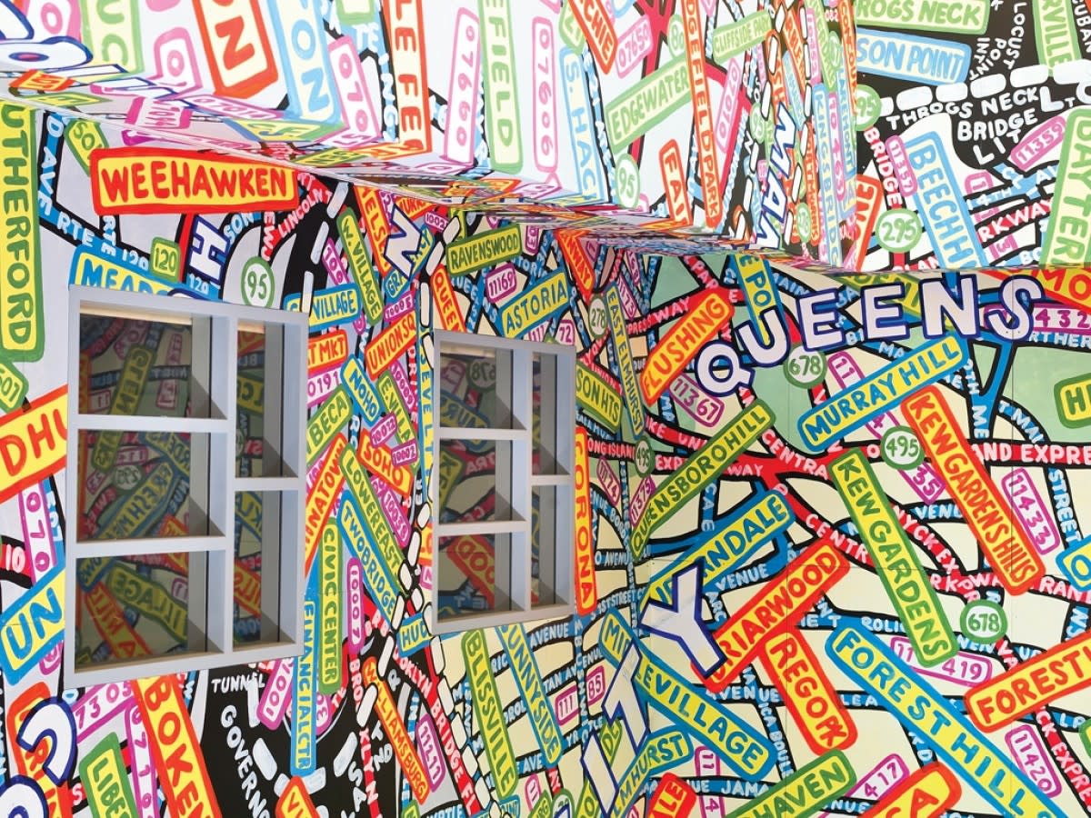
Paula Scher for the Queens Metropolitan Campus
Has it changed the way you’ve been working recently?
It depends on what I’m designing. I’m working on the Summer Season for the Public Theatre right now, the director of the theatre made it Julius Caesar, which is very political.
Very subtle.
It’s going to be a heavy Subway system.
An interview with Paula Scher-3
There is a particular mystique surrounding Pentagram as an agency, the scale of the output from that building is mystifying. Why is that?
Because we don’t have any business partners. Pentagram was started in the 60s, when it was Fletcher/Forbes/Gill. Now partners change, but it’s founded on an idea, and the idea is what is sustainable. The idea here was that a group of like-minded, talented people, who were all practitioners, could come together and run and manage a business where they accepted a notion that they were equals. That meant that they would have an equal vote, would share money equally, and is cooperative – that’s very hard to do.

"I'll probably never know [when I've done my best work]. The point isn’t to have done it, because if you’ve done it, you’re done."

Paula Scher
An interview with Paula Scher-4
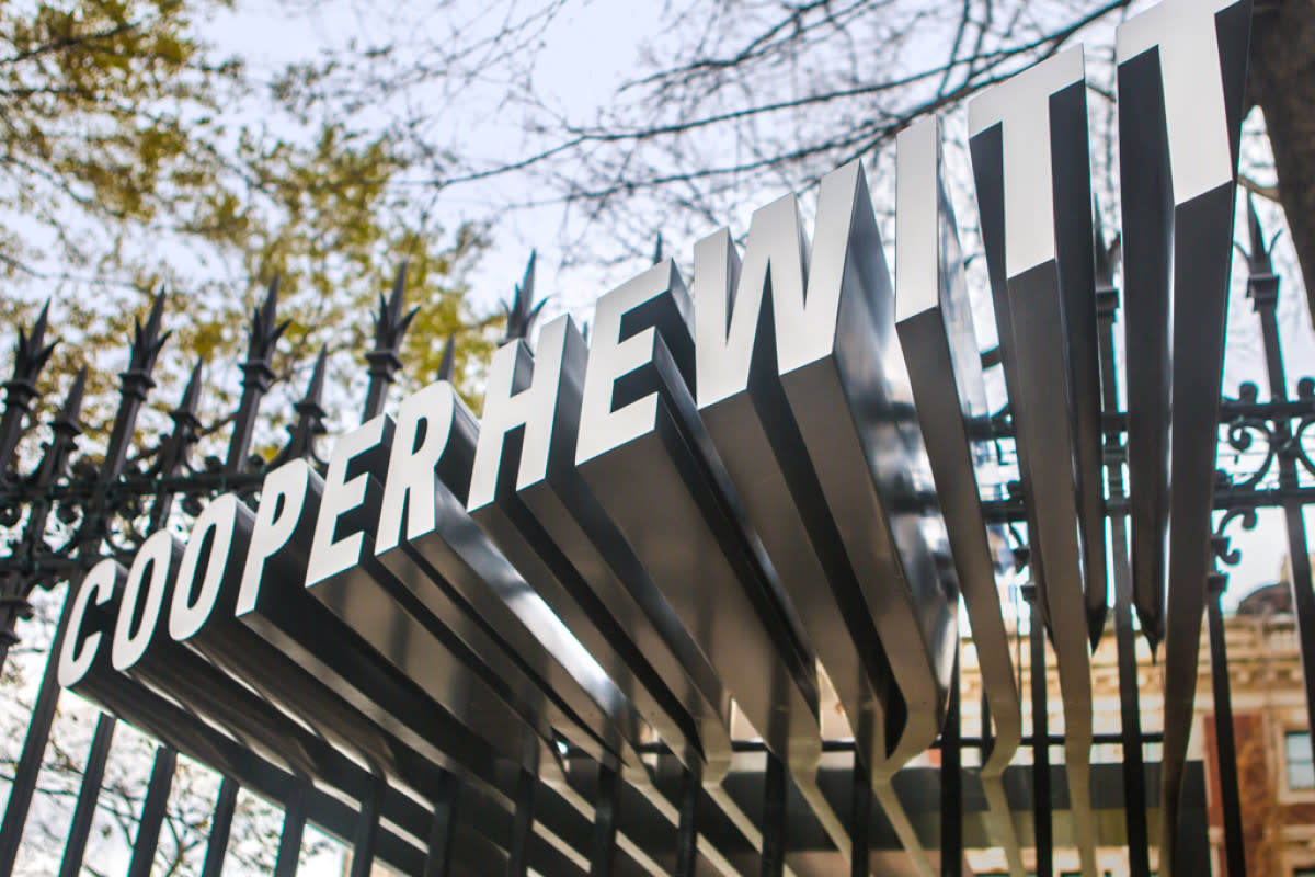
Signage for the Cooper Hewitt Design Museum
Do you grapple with the weight of Pentagram’s reputation as a leader in design? 
No! (laughs). Why would I do that to myself? Do I have to worry about your feelings when I’m designing? My God, it’s bad enough to get the client involved.
Considering your job as a principal at Pentagram and a teacher around New York – what does leadership mean to you?
That’s a really good question. You want people to learn from you if they’re your students and your staff, and you don’t want to cripple them from getting ahead. You want to do your own work and succeed and grow, and you want everyone else around you to do the same thing.
You’ve said in the past that you kick-started your own style by rejecting classical teaching methods like Swiss International. Do you try and steer away from that?
If I hadn’t had a classic education I wouldn’t have rebelled against it. Victor Miscoso would have never done all that crazy psychedelia without Joseph Alberts to rebel against. Each generation has to push back against what came before it. That [psychadelic style] was how it was the moment I walked through the door. If I had walked in five years earlier I probably would have embraced it.
Have you noticed people rebelling against your style?
Sure – everyone whose work is clean. Everyone that’s nice and neat (laughs), and ordered, and operates on the web.
That’s interesting because so much design now is set to grids and code and is pushed to be as aesthetically pleasing (on digital platforms) as possible. Your style is more organic and hands-on. Is there a tug of war between what you do and the expectations of the digital era?
I’ve noticed a lot of people moving against the grid, and typography is becoming a lot more eclectic than, say, five years ago. I think there are certain forms of what I do that become popularised in certain ways, because they were popular in another time. Things have a way of going in and out of fashion, I think that right now, typography is in a really spectacular period, so much can be done with it. We’re entering a new, more expressive phase, which is great.
Have you had a chance to watch your feature episode on Abstract: The Art of Design?
Yes!
An interview with Paula Scher-5
Abstract: The Art of Design. Source: Netflix
Something I found quite interesting was your cognitive ability to process a lot of information and come to a rational conclusion. Can you learn that skill?
Y'know, I don’t know. It was something I discovered early. I have an ability to reject information that is useless. There are things that tell you something, and things that really don’t. I don’t know why I can synthesise that, but it’s been a tremendous advantage, as it’s really about reductions, and it helps you get to the point faster. I find when I get masses and masses of information from clients – demographic studies and things – I feel so bad for them because they wasted so much money. If they were getting it to re-design themselves, then they weren’t getting the right information.
You know the people of New York quite well, and design for their needs (The New York Ballet, Metropolitan Opera etc.) how do you design for people you don’t know?
I don’t think that’s particularly difficult. All you do is determine when something is in a certain milieu, what the expectations are in a certain milieu, which you can readily identify by looking at it. What your job is, is to reflect those expectations because they matter to the people you’re talking to: that’s one role for your client, then your role is to elevate their expectations just a little bit, so that you’re looking at a certain set of expectations that a public has, and you want to pull them forward without alienating them by taking them too far. That’s always the job, no matter what the job.
How has the role of graphic design changed for you over time?
People are much more aware of it. They want it, and the understand it more.
I think we’ve moved from a verbal society to a visual one. People don’t have much patience for reading, as shown by our new president, so we communicate visually.
Trends come and go. What stays the same?
There are shifts, and they’re usually generational, but they happen more frequently now. It used to be around a 5-7 year cycle, now it’s closer to 2-3 years: Something starts out, and it looks weird and you’re made nervous by it because the introduction to anything is weird. Then people start imitating it, then someone perfects it (because the first one is usually odd), then it becomes a style, then it becomes expected, then it becomes hackneyed, then it’s dead. Until it gets resurrected in a different form. This is always the same.

"I think we’ve moved from a verbal society to a visual one. People don’t have much patience for reading, as shown by our new president, so we communicate visually."

Paula Scher
An interview with Paula Scher-6
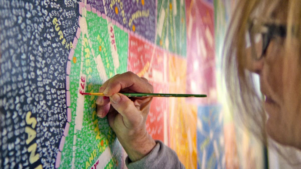
Abstract: The Art of Design. Source: Netflix
A lot of the work you have done around New York has given the city its unique edge. How can cities reject the design standards that come from globalisation?
There is a certain form of international style that always happens when like-minded people know each other. It’s happened in architecture to a degree, and it’s usually from someone who uses a material, then everyone uses the material, or somebody establishes a way of using computers to make a skin on buildings and everybody does it, and these things come in waves. But there’s always a city in there – the location and the people around it – that changes the context. When you go to a New York Airport it's just as grim as any other (laughs), you don’t even know you’re in New York. So when you’re in an airport or a duty-free area, then what you’re saying is true. It’s a global world without distinct personality, but the minute you hit the city everything changes. Even in the States it does – L.A feels different from New York, L.A feels different than San Francisco, New York feels different from almost every city in the nation and Chicago is so unique you would never confuse it with anywhere else. Even with all the homogenisation that you perceive in global brands, it really hasn’t done much to change the character in the streets.
How does the graphic design industry deal with diversity?
My team is totally global. I really got scared with our president because I had so many people on Visas working for me. Pentagram is a global company, our staff are from all over the world. I don’t even think about it, it seems like an old subject.
When did dealing with corporate power structures stop being a challenge?
When I figured it out. I can actually tell almost instantly when something won’t work for me, when I walk into a corporate situation and I know it’s going to be a disaster, because I can tell by the personality types the way it is structured, then of course some other places are lovely.
Are you able to reject work based on the behaviour of a client?
It really depends on which month you were talking about (laughs). There are ups and downs – times when you don’t want to bother with something and other times when you feel like ‘maybe I should be more open-minded about this’. To be honest with you, just today I met a personality that I don’t want to work with.
Can you ever just say no?
It’s more about ‘what do I need to do to protect my relationship with my team’. Pentagram is like a bunch of little businesses strung together. I have my team, and I want to be profitable and I get to choose how I want to do that, but I still have to make a lot of little decisions to be profitable.
An interview with Paula Scher-7
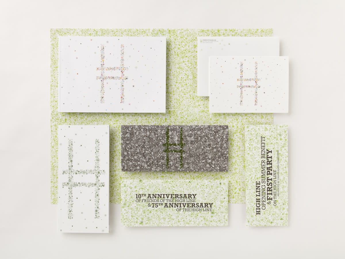
Identity for The High Line.
On the flip side of that. What makes the perfect client?
I have some great clients! They have to want me to do my best work. They have to hire me because they believe that my best work is in their best interests, and they have to be honest and direct, and include all the people that need to be included in the process so someone isn’t left out.
And be nice.
Yes, that too.
Your father was an inventor. What is your relationship like with technology now?
Well, I’m talking to you (laughs).
I use it all the time. I’m not a designer who sits down at a computer and ‘designs’. I’m a designer who still draws on paper because that was the way that I was taught – that’s the way I work.

"The minute you try and ensure perfection, you’ve made something pretty horrid."

Paula Scher

How do you know which are the best tools to use?
It’s a strange question to me. I don’t think about equipment when I design. I think about what I want to make, and I’m looking outside of a screen for what I want to make. I look at things that exist, things that exist in history, then I work with my team to work up what we think is possible. We try all kinds of things – but we don’t have software discussions. Some things are 2D, some things are 3D, I work on virtual reality. All of it.

Over time people will rebel. Designers just line the way with their accidents.

Paula Scher
An interview with Paula Scher-8
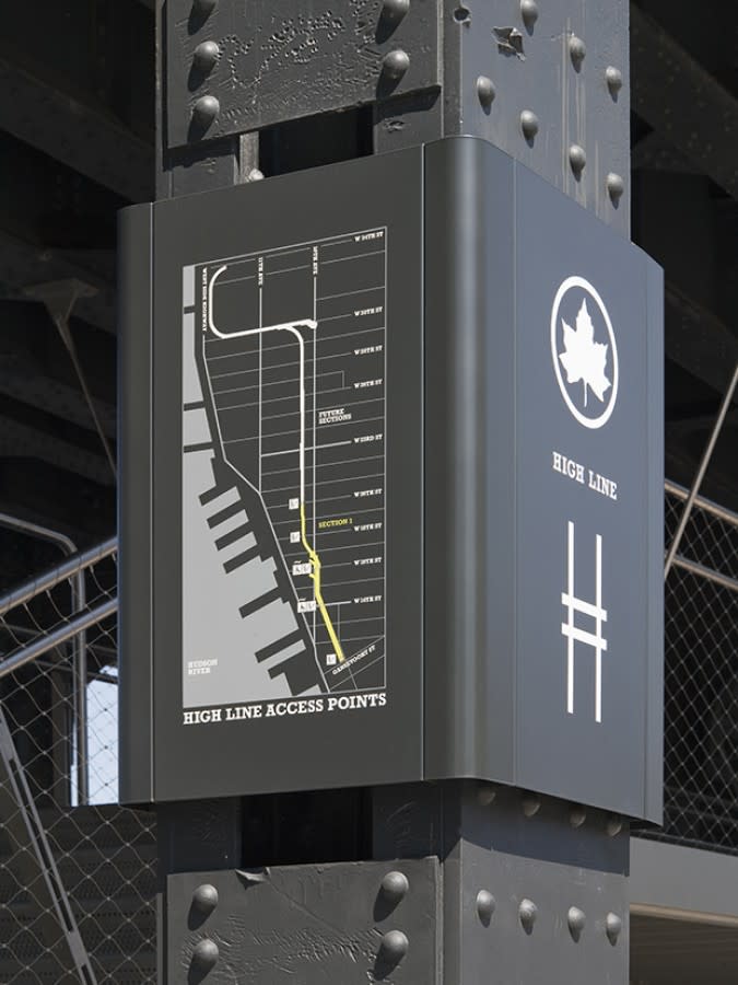
Left: Signage for The High Line.
An interview with Paula Scher-9
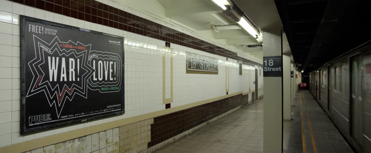
Right: Exterior for The Public Theatre
Do you see younger designers struggle with digital technology for what analogue could solve instantly?
Not anymore.
I’ve been teaching for nearly forty years. And back in the 90s my students worked the way I worked. Then from about 1991 to last year, I found the students were always talking about the technology, always struggling with the technology. They wouldn’t do something a certain way because they didn’t have access to that sort of typeface. But now they can do anything. They can draw thumbs, they can program them, they can make them move, they can work in photoshop, bring dimension, all kinds of fantastic things. And we don’t talk about it! I don’t think it’s that interesting. To me, it was always like cars – there were those guys who liked to talk about the kinds of equipment that was in their cars. Does this car go? How fast did you go? How did you get there? Is it interesting? Maybe, maybe not. It’s all just traffic anyway. I know I’m supposed to be interested in it, but I’m not.
In your episode of Abstract you talk about how neither you nor your husband collaborate with each other. What are the rules to good collaboration?
Don’t be married (laughs).
I don’t know that I’m a great collaborator anyway. To collaborate, you need to be cross-disciplined. I do well working with an architect, and I do well working with a product designer, but I don’t do well working with another graphic designer, unless you’re just kind of bouncing an idea off of them. You can’t really collaborate on another graphic design, because there has to be a leader. What you do if you’re collaborating, and if you’re equals, is that you’re correcting each others mistakes, and if you’re doing that you’re going to do that you’re going to make something pretty flat, because all the interesting stuff is in the tension and the struggle.

"When you’re young, you try things that are stupid, and sometimes that really works."

Paula Scher
An interview with Paula Scher-10
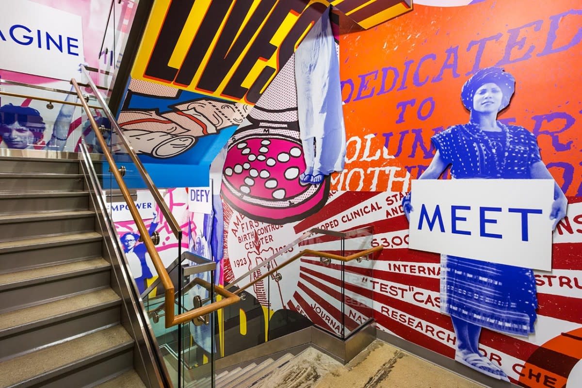
Mural for Planned Parenthood's New York Headquarters.
You once said that being inexperienced keeps you from conforming to rules. How do you stay unique once you learn the rules?
It’s harder. The problem is that it’s a self-editing process – you know something doesn’t work so you don’t try it again. When you’re young, you try things that are stupid, and sometimes that really works. I found that when I started doing environmental graphics. You approach something with a kind of naivety that’s really terrific, and it’s hard to do that as you’re more studied and you know more, so you have to step outside of your comfort zone.
Are you still on the Design Commission for the City of New York?
I went off last year, I was on for about seven years.
But you’re still on the board for the Public Theater and quite a few other city-wide services.
Yes.
Do you have to let yourself go for the greater good? Where things that may not be your personal style may be in the best interest of the city.
For the design commission, I was in a position where I was raising a standard that was very low. All of that matters – it matters that they would make very strange decisions: for example, there were these things called ‘business improvement districts’, where they would improve sidewalks, but they were run by tax codes, so they would do a section of sidewalks, then skip a part because it was a lower-tax code area, then re-start again. It was disgusting – we would just hold back the approval process until they agreed to pave the whole area. You had to use your power that way, and sometimes it was boring to sit there and look at their bad paving. They would do crazy things in NYC – one side of Houston Street was a higher tax district than another, so one had paved marble curves, and the other side of the street was just ordinary concrete – that’s not nice, it’s just rude! (laughs). It really isn’t about design, it was about being nice to people.
I liked Mayor Bloomberg. He did a lot for the city and I saw him as ‘The Design Mayor’. Some of the things we did were more extraordinary than building the curbs, because he was building all kinds of wonderful things, and that was exciting to be part of. It became less exciting when he left office.

"In transportation, and in the sort of things that improve the quality of life; environmentally, in buildings, in prefab housing, in areas where human beings need to have a better existence, being able to design better public spaces and parks. All those things really matter."

Paula Scher
An interview with Paula Scher-11
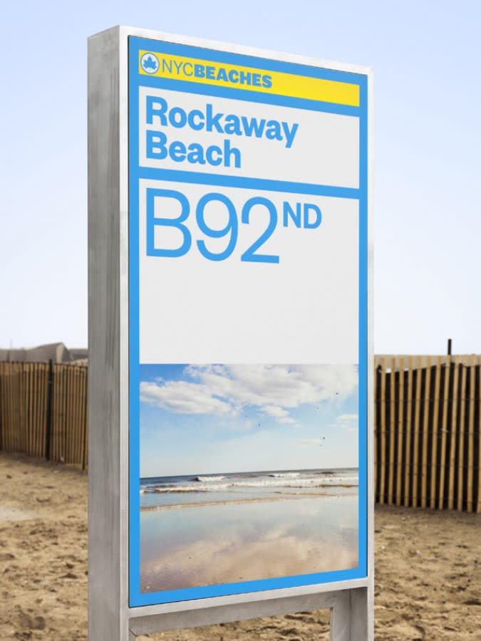
Left: Signage for Rockaway Beach.
An interview with Paula Scher-12
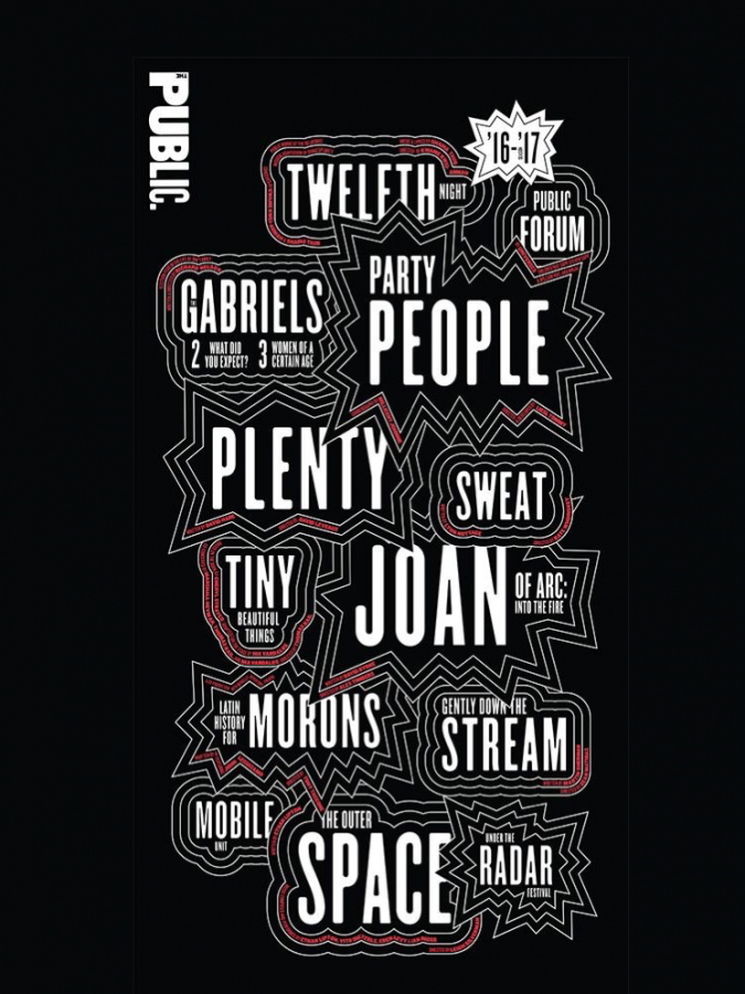
Right: Identity, Public Theatre, 2014-2015
What makes a great neighbourhood?
You can’t design a neighbourhood, because then it will look designed. It has to be a combination of design, and accident. The accidents have to be based on a diversity of wealth. There is an area in New York called Battery Park City, and all the buildings were designed where they go well together, and they came down to the design commission because they wanted to put up their own decorative street signs, instead of the standard New York City street signs. They made the whole community look like they were in the suburbs – like, why would you want to live in New York City? Just move to Westchester with these stupid things. That’s a group of people that came together and they all have the same amount of wealth because they were all living in this development across the West Side Highway from Downtown, and they made this enclave that was a horror. If they had a more diverse community, they would have never done something so silly. The minute you try and ensure perfection, you’ve made something pretty horrid.
There was a very famous suburb on the outskirts of New York, called Levittown, and all the houses were exactly the same and built in the 50s. Over time the trees grew up, and began hiding the houses. Then people started adding to the houses. People moved in and out and some people put towers on it, and other crazy things. And now it’s a terrific neighbourhood, because human beings will not stand for that type of regiment. Over time they will rebel. Designers just line the way with their accidents.
An interview with Paula Scher-13
Levittown, 1960. Source: Levittown Public Library
What is your criteria for pro-bono work?
I have three criteria, it has to be:
1. Something that I’m interested in that I can make better, and have a lot of creative freedom with
2. Something where I elevate a certain type of work – by agreeing to do it for free, I have the ability to do something that is going to be widely seen that elevates an area.
3. Something I just simply believe in and want to see done.
Can you give an example?
The Public Theatre has been completely free for the past ten years, but that’s my lab. That’s where I experiment and discover things. Something I donated that was completely a gift to New York City was the Parks Department signage. They didn't have any budget to develop signage for the entire city. I’m not talking about the parks funded by the wealthy, just the public parks. I can do it, so I did. They are still rolling it out very slowly, they don’t have a lot of money, but that was something I did as a gift. I wouldn’t say it was a pro-bono project, it was a gift – here you go, fix it up.
The third one that was sort of accidental that I ended up getting paid for later was Shake Shack. I did the identity for them because it was across the street from Pentagram, but what was great about it was this architect named  James Wines, a really wonderful architect, had done a structure that was really unusual for a fast food place, so I could supply graphics that were unusual for a fast food place. So that changed the perception of what your expectations are for a hamburger stand – so that was great. Those sorts of things are the right things to do.
An interview with Paula Scher-14
Shake Shack identity
Outside of graphics, where does design have the strongest thing to create change?
Obviously in transportation, and in the sort of things that improve the quality of life: environmentally, in buildings, in prefab housing, in areas where human beings need to have a better existence, being able to design better public spaces and parks. All those things really matter.
You said you keep going because you like to believe you haven’t created your best work. How do you know when you’ve done it?
I’ll probably never know. The point isn’t to have done it, because if you’ve done it, you’re done.

Recently in: SYDNEY / AUCKLAND / WELLINGTON / ABU DHABI / SINGAPORE / PORTO / TOKYO / LOS ANGELES / NEW YORK / LONDON / STOCKHOLM