Mapping Paula Scher

This is number four in our series of interviews with Abstract: The Art of Design executive producer Scott Dadich, and in this installment, we discuss the legendary graphic designer and painter Paula Scher.
Oh yeah.

“I could never walk into an office and sit down at my desk to design; I would accomplish nothing. I can sit down at my desk to read my email.”
Paula Scher
(Laughter) Well, when the series comes out, you’ll see that she is not a fan of that work either.
Yeah. She has a great line in the piece where she says, ‘So, the Boston cover is dumb.’
Yeah. Rocket ship guitars leaving behind an exploding planet earth; maybe not her favorite design.
I mean, ever since my earliest days in design school, she has been one of the lions of our craft. Her use of architectural scale is truly unmatched. The volume of the work that she has done to impact so many industries, businesses, communication forms… It was just breathtaking to see the scope of her work. I was fortunate enough to have an op-ed published by The New York Times back in 2000, and to my utter delight, when that was published Paula Scher did the op-art to go along with my op-ed.
Yeah, it was one of those moments when I couldn’t have been more proud or more thrilled. I’ve read her books cover to cover multiple times, and I’m just a massive fan of hers. I think, for me, Bring in ‘Da Noise Bring in ‘Da Funk was that formative moment where I snapped to attention and understood who she was and the power of her work.
Yeah, I met her probably ten years ago, back when I was starting at WIRED; it was probably about that time; and I met her through the SPD community, The Society of Publication Designers.
I definitely miss working at WIRED.
Well, it’s one the most exceptional gatherings of talent I’ve ever been fortunate enough to be part of. The sheer brain-power on that floor over on 3rrd street (San Francisco) and in the Trade Centre in New York, you know?
Some of my favorite people on the planet are WIRED colleagues. I see them as friends as much as colleagues. There’s certainly a place in my heart where I’ll always find great fondness for WIRED.


“I walk outside and I see typography everywhere. New York City is a city of signs. Sometimes things written by hand, mismatched, hung up in some peculiar way, and you think, ‘Oh my God, can I please get up there and readjust that sign? Because it’s absolutely awful.’”
Paula Scher
Is she? I’m not sure about that.
Well, Tinker (Hatfield) is right there with her, I think? I’m not sure about ages.
Well, she talks a lot about that in her episode, actually. When she started in design, it was a craft lead by your hands: Xacto blades, paste-ups, everything done by hand. And that was certainly the case in husband, Seymour Chwast, too. And when the computer came, it changed the dynamic of how a designer spent their time. So where a thing used to take a week to create, it could now be created in a day; and if something normally took a day to create, now it was done in an hour.
So it demanded a different response from the designer in how they would work with their client. She definitely goes into that in great detail; she talks about the implications of what that has meant for her work inside the episode. So I won’t say much, only that she addresses those concerns.
“I used to paint my fonts by hand when I was a young designer, and I really miss it. When we became fully computerized in the late 90s, I didn’t touch anything and I didn’t use my hands. In the past, I cut things up, I ripped things, I pasted things, I touched art supplies. That physical loss was huge for me, and that’s why I started painting.”
Paula Scher
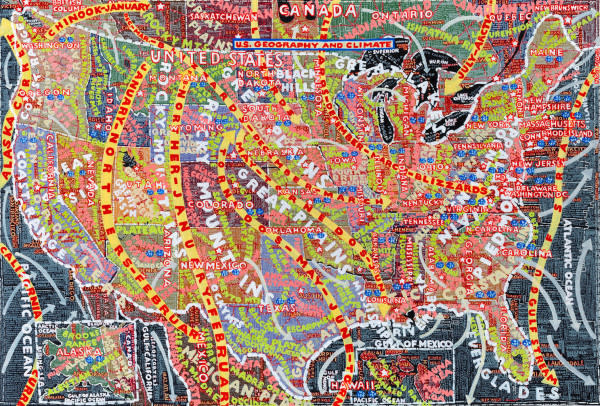
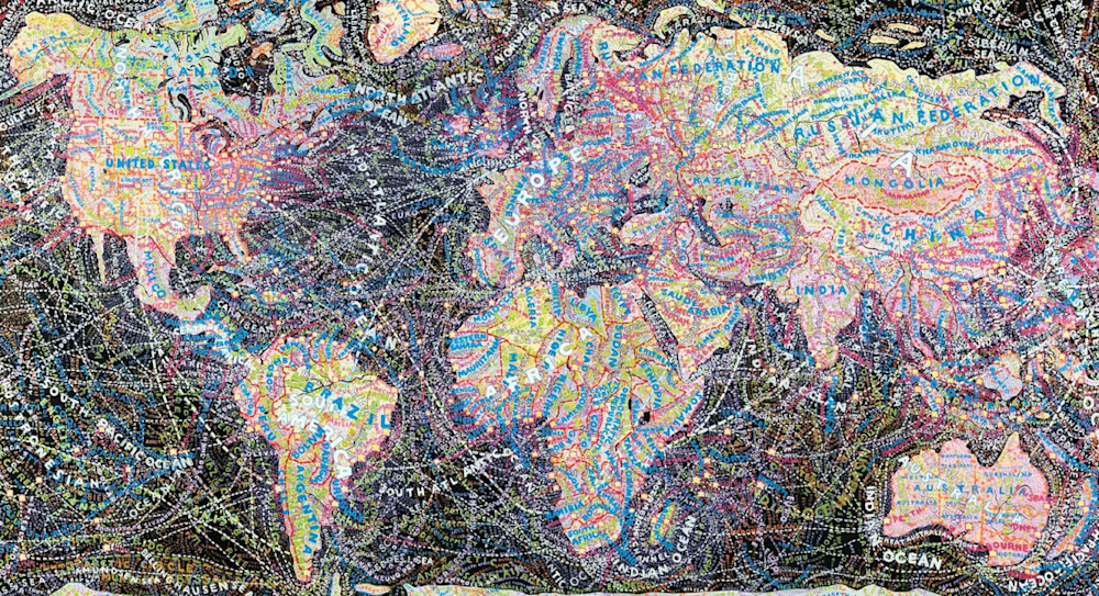
Well, the thing that she is known for, the work that she has done by hand, and even now, maybe even receiving more notoriety for her map paintings and her fine art because it is done by hand and hand-painted. So what tools are correct for the right communication are certainly front-of-mind for her.
Yeah, I’ve been really fortunate.
I mean, working with the President, more than anything, I really wanted to do right by his time; you realize the profound weight and responsibility that he has, and you can’t waste a second of his time. Everything he does is important, and you just want to be of value to him and his team. And with Paula, her talents are so profound, I just have the utmost respect for her, and I want to be around her because I learn so much every time I am.
It does. But I still definitely get nervous.
“I was influenced by contemporary culture: Zig Zag rolling papers, Zap Comics, underground newspapers and magazines and record covers–especially record covers–those were the things that I really wanted to do. They spoke to me.”
Paula Scher